Graphic Design
Gold Path Solar
2025
With the launch of an updated website, a new brand identity was created for an Ohio based solar energy provider.
Ideation
Inspiration was drawn from the brands mission at heart.
Helping you find and navigate your brightest path forward.
Inspiration was drawn from the brands mission at heart.
Helping you find and navigate your brightest path forward.

Logo
Wanting to create an icon that encapsulated their mission, a geometric mark was designed.
Wanting to create an icon that encapsulated their mission, a geometric mark was designed.

Typography
The Futura PT family was chosen, stemming from geometric similarities between the icon and typeface.
A variety of weights allows for a diverse set of typographic solutions.
The Futura PT family was chosen, stemming from geometric similarities between the icon and typeface.
A variety of weights allows for a diverse set of typographic solutions.

Applications
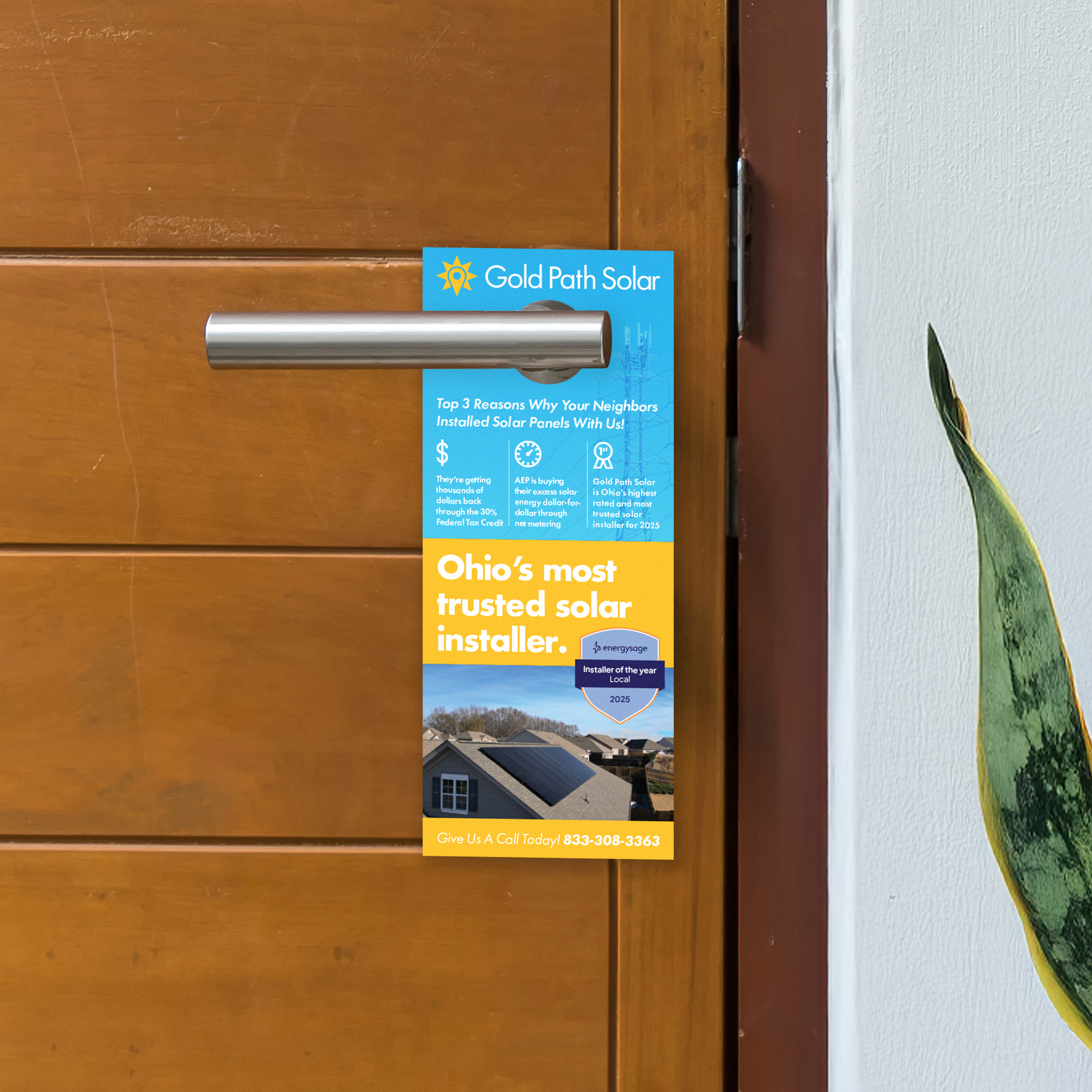
A variety of new applications and use cases.
A variety of new applications and use cases.


